What the K-Shaped Economy Is, and What Just Shifted

- The term describes a split, not a downturn. Some households and sectors move up one arm of the K while others slide down the other, and the aggregate numbers can look fine throughout.
- The shift is what it is now called. It arrived in 2020 as the shape of a recovery — a temporary thing that would resolve. US Bank now describes it as ‘a structural pattern of uneven resilience’, which is a different claim entirely.
- The concentration is on record. Federal Reserve distributional data put the top 1% at 29.2% of household wealth in Q4 2025 against 5.3% for the bottom half, and Moody’s Analytics puts the top 10% of earners at nearly half of all US consumer spending in 2025 — the highest share recorded.
- The labour market is the engine. Hiring has fallen to a 15-year low of about 3.2% while layoffs sit near a historic low of 1.1%. If you have a job you are unusually safe; if you want a better one, the door is unusually shut.
- It shows up in the shopping data. NIQ finds sales to households on 150,000 dollars and up rising as a share every year from 2022 to 2025, while nearly every major category went backwards for households under 50,000.
A K-shaped economy is one where the average is telling you almost nothing. Some households and industries travel up one arm of the letter while others travel down the other, and the national totals can look perfectly healthy while that happens.
The term is six years old. What has changed in 2026 is not the shape but the claim being made about it.
What is a K-shaped economy?
A recovery, or an economy, that splits instead of rising together.
US Bank’s explanation of the origin is the clearest one: the term “emerged during the COVID-19 pandemic to describe a diverging recovery, where some segments of society and industry rebounded quickly while others lagged”. The letter was chosen against the alphabet of recovery shapes people were arguing about at the time — V for a sharp bounce, U for a slower one. A K has two arms going opposite ways.
What separates the arms has been fairly consistent since:
“The K-shape reflects a bifurcated path: high-income households and capital-intensive sectors benefit from asset appreciation and technological change, while lower-wage workers and labor-intensive sectors face more limited income growth and thinner financial buffers.”
SVB’s version of the upper arm is more concrete: that segment “experiences rising incomes, increasing wealth and robust employment opportunities”, helped by rising financial markets, while “lower socioeconomic groups face declining purchasing power and financial stress”.
So what has actually shifted?
The word “recovery” has been dropped.
This is the real answer to the question, and it is a change in category rather than in degree. A recovery shape is temporary by definition — it describes how an economy climbs out of a hole, and it stops being relevant when the climb is over. That was what the K meant in 2020.
Here is how US Bank describes it in 2026:
“Today, the K-shaped economy is better understood as a structural pattern of uneven resilience — one that influences how growth is distributed, how shocks are absorbed and how risks emerge across the economy.”
NIQ puts the same idea more bluntly: “the K-shaped economy is no longer a hypothesis.”
Read those carefully. Nobody is saying the gap has suddenly widened this year. They are saying it has stopped being an event and become a feature — something you build models and business plans around rather than wait out. That is the trend shift.
How wide is the gap?
Wide enough that the concentration figures are setting records.
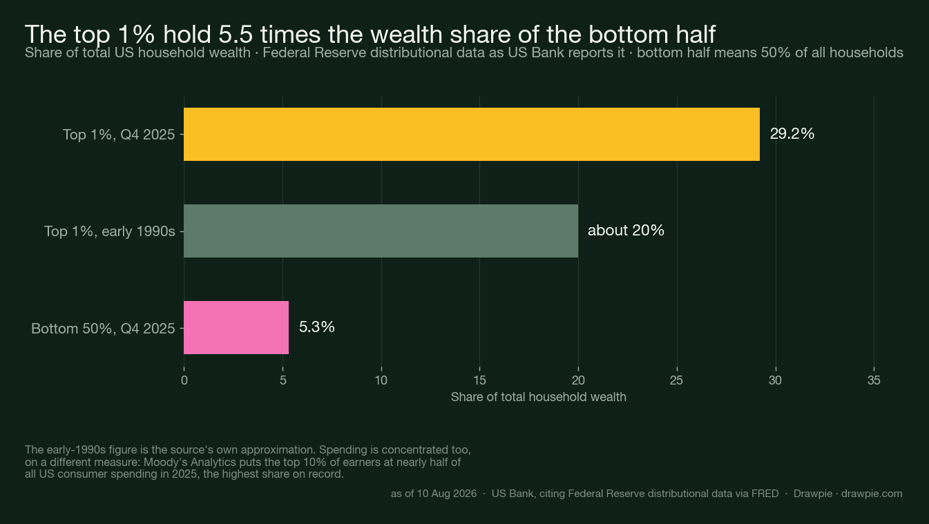
On wealth, Federal Reserve distributional data as US Bank reports them:
| Group | Share of US household wealth |
|---|---|
| Top 1%, Q4 2025 | 29.2% |
| Top 1%, early 1990s | about 20% |
| Bottom 50%, Q4 2025 | 5.3% |
On spending, a different measure pointing the same way: Moody’s Analytics estimates that the top 10% of earners accounted for nearly half of US consumer spending in 2025 — the highest share on record.
That second figure explains something that otherwise looks contradictory. US Bank’s own reading is that it “helps explain how aggregate consumption can remain relatively firm even as broader sentiment stays cautious and many households continue to face pressure from elevated prices and borrowing costs”. A strong consumer-spending headline is compatible with most consumers struggling, if enough of the spending is done by a few.
There is an age dimension too, and it is startling: households aged 75 and over now hold wealth roughly 55% above the national average, against just 5% above in the early 1980s.
Why is the labour market the engine?
Because the way most people move up an arm is by changing jobs, and almost nobody is changing jobs.
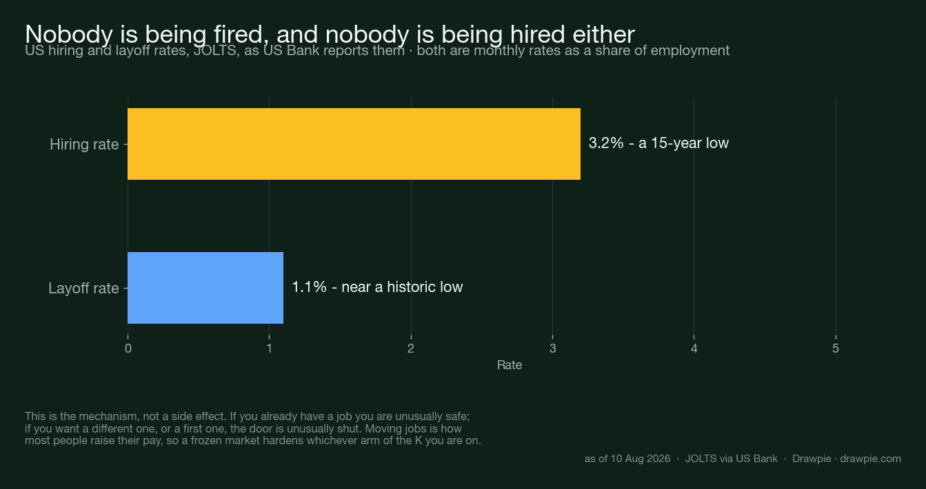
The headline labour numbers look calm. Unemployment is low, layoffs are limited. Underneath, JOLTS data as US Bank reports them show hiring at a 15-year low of around 3.2%, with layoffs near a historic low of 1.1%.
That combination has a name and a consequence:
“In a ’low-hire, low-fire’ environment, workers who are already employed may experience stability, while job seekers and those looking to advance face fewer opportunities. That matters because mobility is a key pathway for workers to improve earnings, move into higher-productivity roles and build financial buffers.”
This is the part worth sitting with. A frozen labour market is not neutral between the two arms. If you are established, it protects you. If you are trying to get in, get back or get on, it is a wall — and it removes the main route by which people used to cross from one arm to the other.
What does it look like in the shops?
Two income bands moving in opposite directions, in the same market.
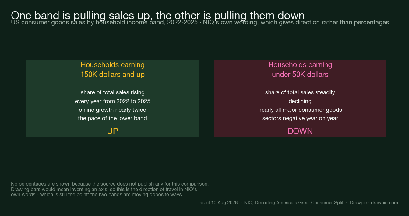
NIQ’s retail measurement puts it in commercial terms. Households on 150,000 dollars and up have been a growing share of total sales, rising every year from 2022 to 2025, with online growth running at nearly twice the pace of the lower band. Households under 50,000 dollars have steadily declined as a share, and for them “nearly all major consumer goods sectors saw negative year-over-year growth”.
The Federal Reserve’s May Beige Book describes the same split from the other side: higher-income households “remained relatively resilient”, while lower-income consumers show “greater financial strain and increased reliance on credit”.
Is the gap still widening?
Not obviously, and that is worth saying plainly.
The strongest recent framing is that the pattern has hardened rather than accelerated. US Bank notes that Beige Book commentary points to more borrowing among constrained households “even as aggregate delinquency trends remain stable” — strain that shows up in behaviour before it shows up in defaults.
So the honest summary is narrower than the headlines: the split is well established, several concentration measures are at or near records, and the mechanism that used to close it has slowed. None of that is the same as saying the gap grew sharply this year.
What the frame does not tell you
It is a description, not a measurement — and it is easy to over-read.
No statistical agency publishes a K-shape index. It is a lens people lay over several unrelated datasets — wealth shares, spending by income band, hiring rates — and the lens is doing some of the work. Two cautions follow:
- All of the figures above are American. The pattern gets discussed elsewhere, but nothing here is evidence about another country’s economy.
- Averages hide the split, and the split hides variation too. “Households under 50,000 dollars” is tens of millions of very different situations, and a band is not a person.
If the frame is useful, it is because it stops you reading a firm consumption number as good news for everyone. That is a modest claim, and it is the one the data actually supports.
Sources
Checked on 10 August 2026. This article reports published data and how institutions describe it; it contains no investment advice and no market forecast.
| Source | What it supports here |
|---|---|
| US Bank — The K-shaped economy in 2026 | The origin of the term, the “structural pattern of uneven resilience” framing, the top 1% and bottom 50% wealth shares, the Moody’s Analytics spending estimate, the JOLTS hiring and layoff rates, the over-75 wealth figure and the May Beige Book characterisation |
| SVB — K-shaped economy in 2026: deciphering the divide | The description of the upper arm, and that higher-income households have benefited from rising financial markets while lower socioeconomic groups face declining purchasing power |
| NIQ — Decoding America’s great consumer split | That the pattern “is no longer a hypothesis”, the rising share of sales to households on 150,000 dollars and up, the declining share and negative category growth below 50,000, and the online growth comparison |
How we verified this
This article does not give investment advice and does not forecast any market. One of the sources is an asset manager’s outlook that includes a trading section; none of that view is carried here, and nothing on this page should be read as a suggestion about what to buy, sell or hold. What is reported is published economic data and how institutions describe it.
Every figure was read on the page it is attributed to. The wealth, spending and labour figures come from US Bank’s 8 July 2026 piece, which sources them in turn to Federal Reserve distributional data via FRED, to Moody’s Analytics and to JOLTS. Where a number is second-hand like that, the article says so rather than implying we read the underlying release.
The early-1990s wealth figure is approximate in the source itself — “closer to 20%” — and is labelled that way here and in the chart.
NIQ publishes direction, not percentages, for the income-band comparison. Its findings are that the higher band’s share rose every year and the lower band’s fell, with nearly all categories negative for the lower band. We have not converted that into numbers, and the chart shows the wording rather than invented bars.
“K-shaped” is a description, not a measurement. No statistical agency publishes a K-shape index. It is a frame that institutions use to organise several different datasets, and reasonable people disagree about how much work it does. The article treats it as a lens rather than as a finding.
This is US data. Every figure here describes the United States. The pattern is discussed elsewhere, but nothing on this page is evidence about another country.